As racers, we’re always looking for an advantage over the competition- better brakes, exhaust, motor work, titanium bolts to reduce unsprung weight- you name it. With the advent of modern electronics, now data logging and analysis is becoming available for not just pro-racers, but club racers as well.
Most data loggers talk about how awesome their hardware is… see how sleek and sexy it looks? It has all kinds of features like GPS and accelerometers which are sampling at many times a second. Just imagine how much data you’ll collect! So then you install the data logger on your bike and you can’t wait until you can go out on track and try it out. Everything is great! Until…
… you download your data and try to make sense of it. Sure there’s a bunch of pretty colors, graphs and it shows you all kinds of things, but how do you convert that data into actionable information to lower your lap time? With that in mind, I’ve created this simple walk through to explain how I use AiM Race Studio 2 to analyze my data so I can go faster. I’m not saying this is the only way to analyze your data; but it’s what works for me and hopefully it give you an idea what software features are really useful and which are just fluff.
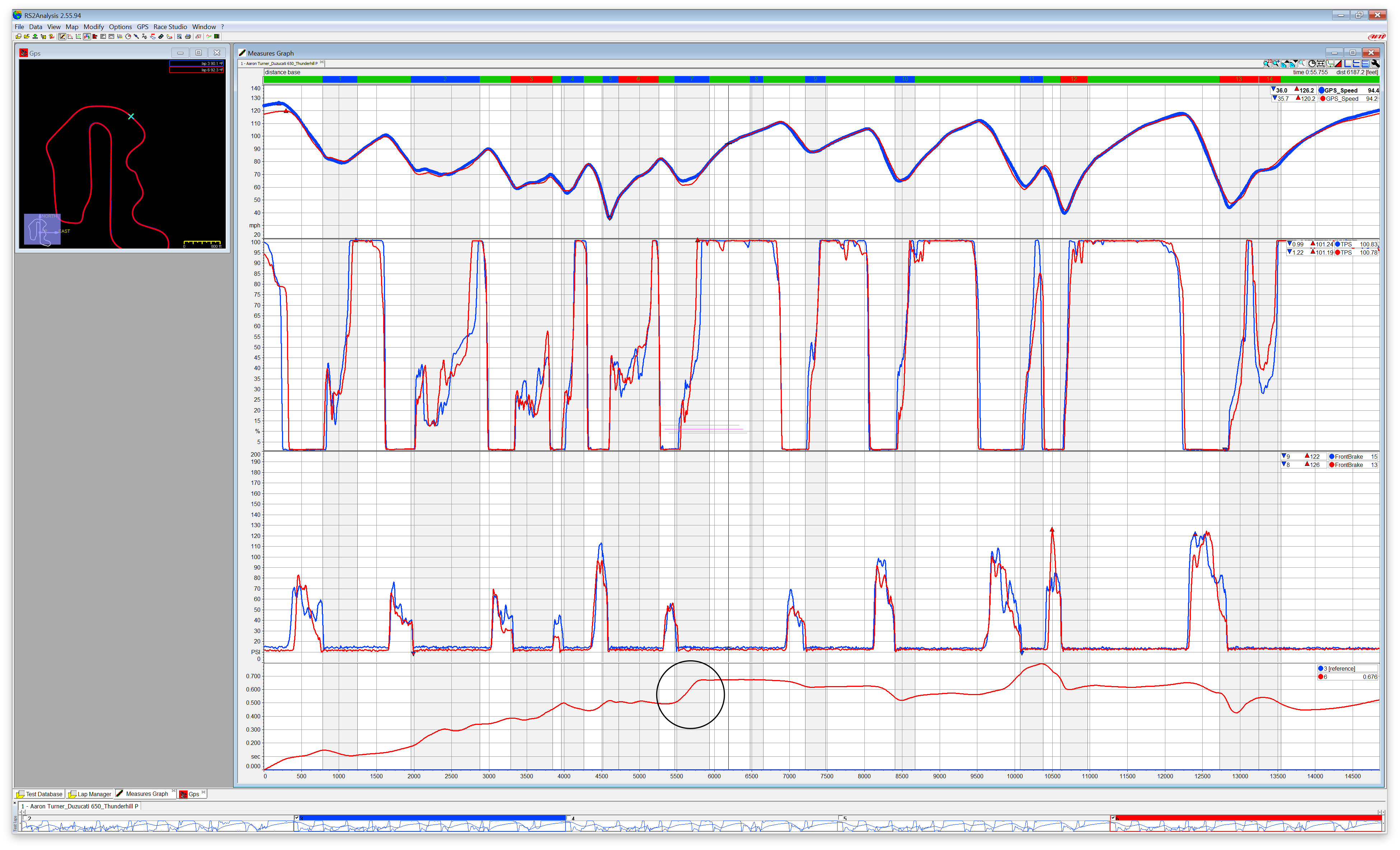
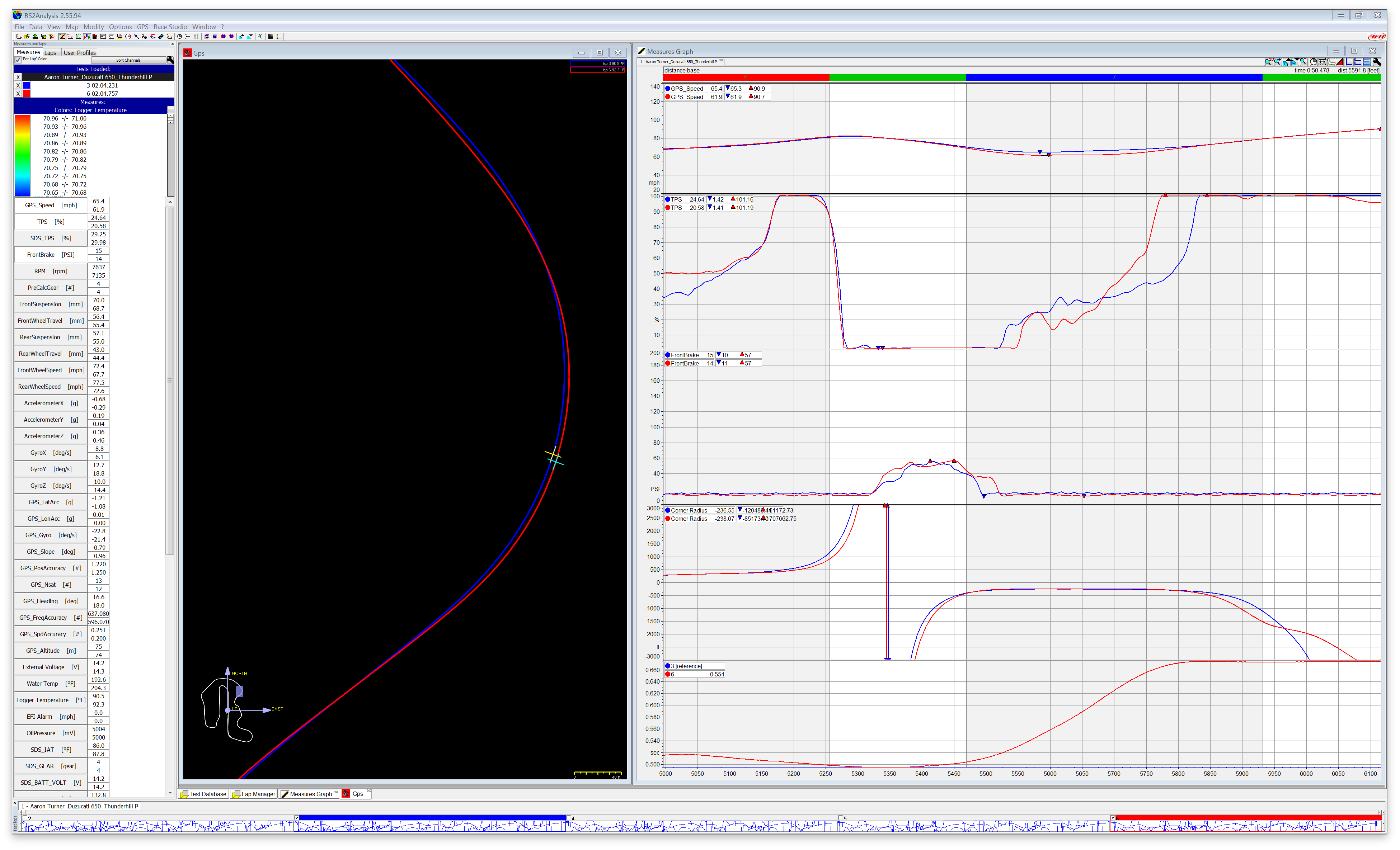
So here I’ve loaded up two laps at Thunderhill during the same race. My goal is to figure out why one lap was faster then the other and use that information to become more consistent and faster:
(Note: I’ve intentionally made the lines on the graph thicker then I normally make them so they’re easier to see in smaller sized images.)
From top to bottom, the graphs are:
- GPS Speed
- Throttle Position
- Brake pressure
- Time slip
When you’re trying to figure out where one lap was faster then another, you need a way of comparing them. This is what the “time slip” graph does at the very bottom of the screen. That’s showing where on track the red lap is slower then the blue lap (which is my reference or baseline). The higher that line goes up, the more time I’ve lost. If it goes down, the red lap is faster in that section of track compared to the baseline lap. To put it in mathematical terms: the time slip is the integral of the speed difference over distance traveled.
If you quickly scan that line, you’ll notice the section of track I’m loosing time the fastest is “Sector 7” which corresponds to what everyone calls Turn 6. I’ve circled the area to make it more obvious.
Looks like I’m loosing nearly 2/10ths of a second in that one turn which is significant. Any time you see the time slip increase quickly like that indicates a good area to focus on. So now the question is “why”? What did I do different so that one lap was faster then the other? Well, let’s zoom in and take a look:
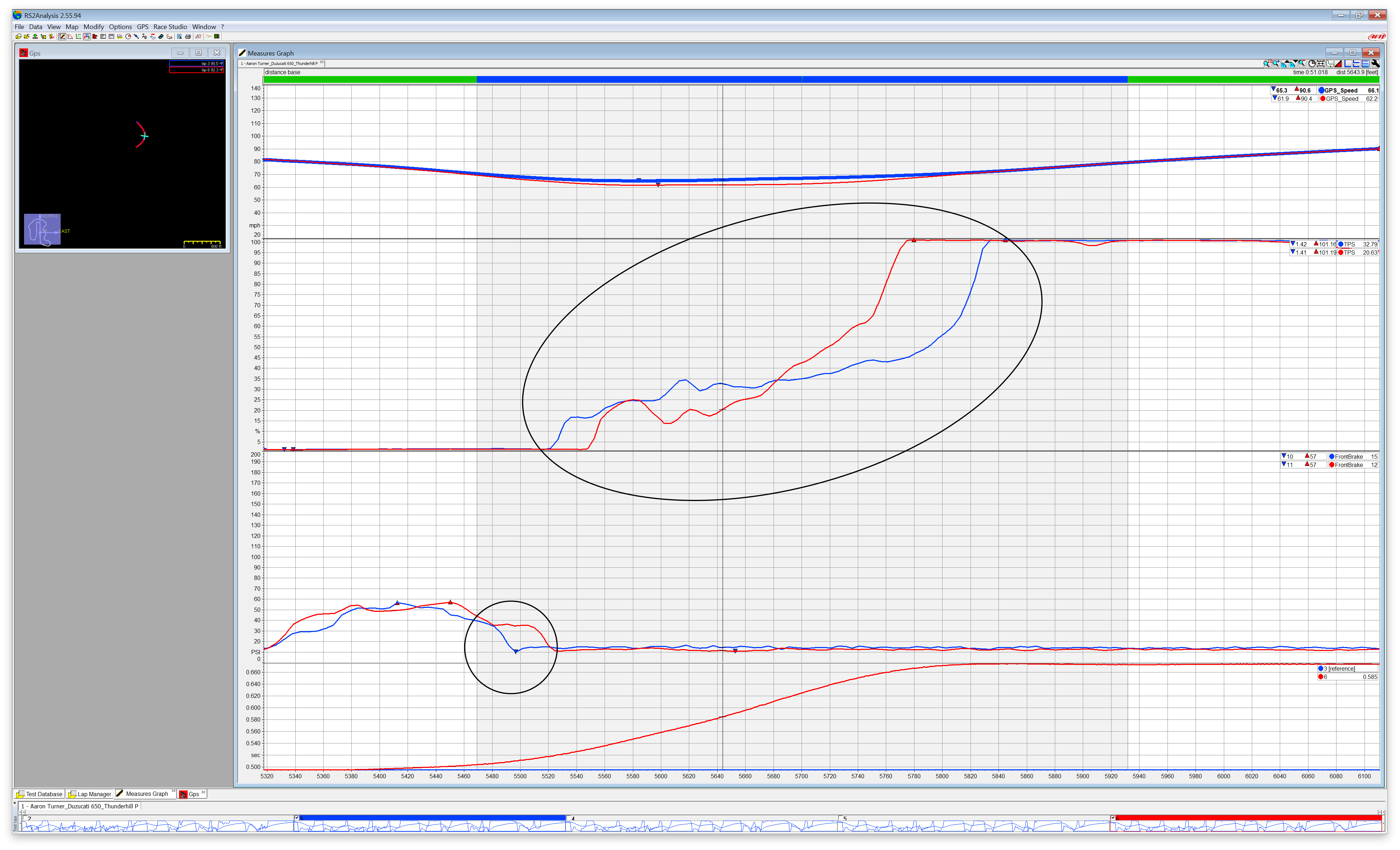
Ok, a number of things stand out:
- I released the brake sooner on the blue/faster line. This is where I start gaining time.
- I got on the gas sooner and smoother on the blue/faster line. More time made!
- I got to WOT sooner on the red/slower line!
- I’m 4mph faster (66.1 vs 62.2mph, see upper right corner) at the point specified on the track/vertical line on the graphs
- Obviously, my bike doesn’t have enough horsepower even at WOT to make up for the slower speed through the corner and delay of cracking open the throttle. Yes, it ends up being just as fast exiting the corner (see how the speed traces converge), but I never make up the time I lost in the corner!
Is there anything we can learn about the line through the turn by looking at the data? It turns out there is. From reading “A Practical Guide to Race Car Data Analysis” by Bob Knox, I learned how to create a math channel for the Corner Radius. He gives some info on how to look at the resulting graph and interpret the data. Here’s what I see when I create that math channel:
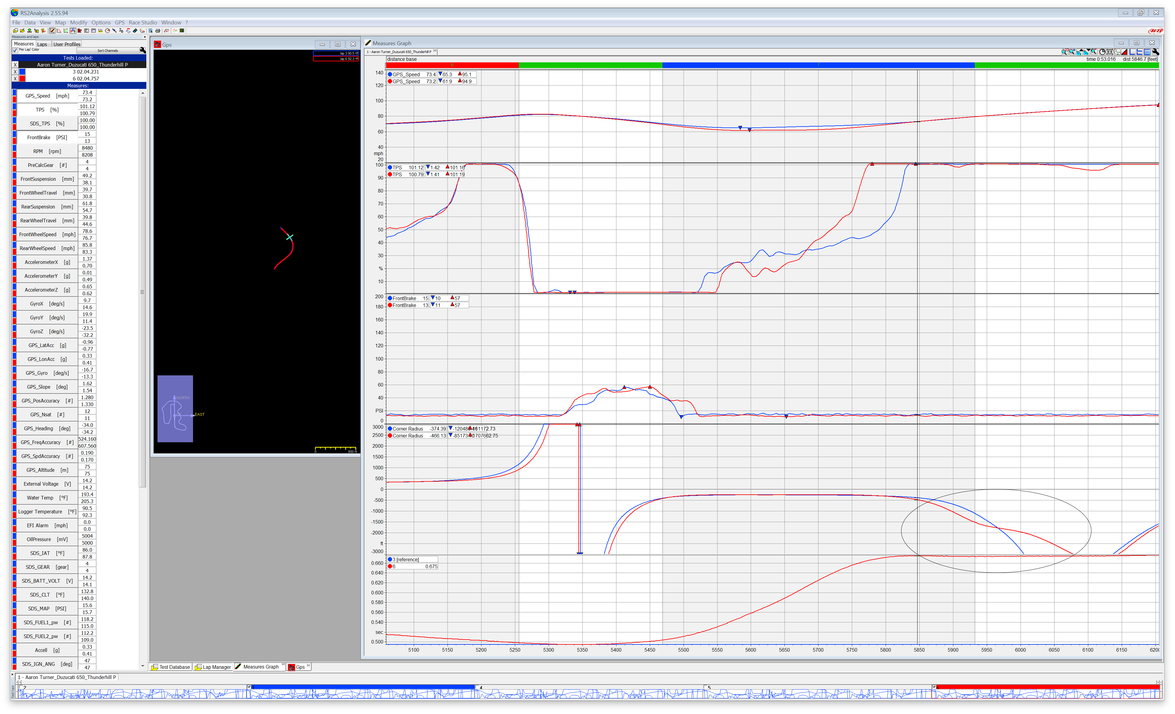
So basically the Corner Radius graph shows the turn radius in feet and gives a nice clear indication of the line through the corner. The center/0 is a 0ft radius turn, while positive infinity/negative infinity is straight. If you look at the end of the turn, you see on the blue lap I smoothly adjust my line on the exit of the corner in one fluid motion, but the red line I clearly start to make a mid-course adjustment to stay on track on the exit. I didn’t have to roll off the throttle, but this is another clear indication that my line needs work due to that correction.
So now let’s take a look at the racing line using the straight GPS data:
Ok, so clearly the blue/faster line is on the inside of the red line and probably closer to the apex. But that’s still hard to understand in a vacuum- it would be really nice to know where the track edges are, so I export the data into Google Maps:
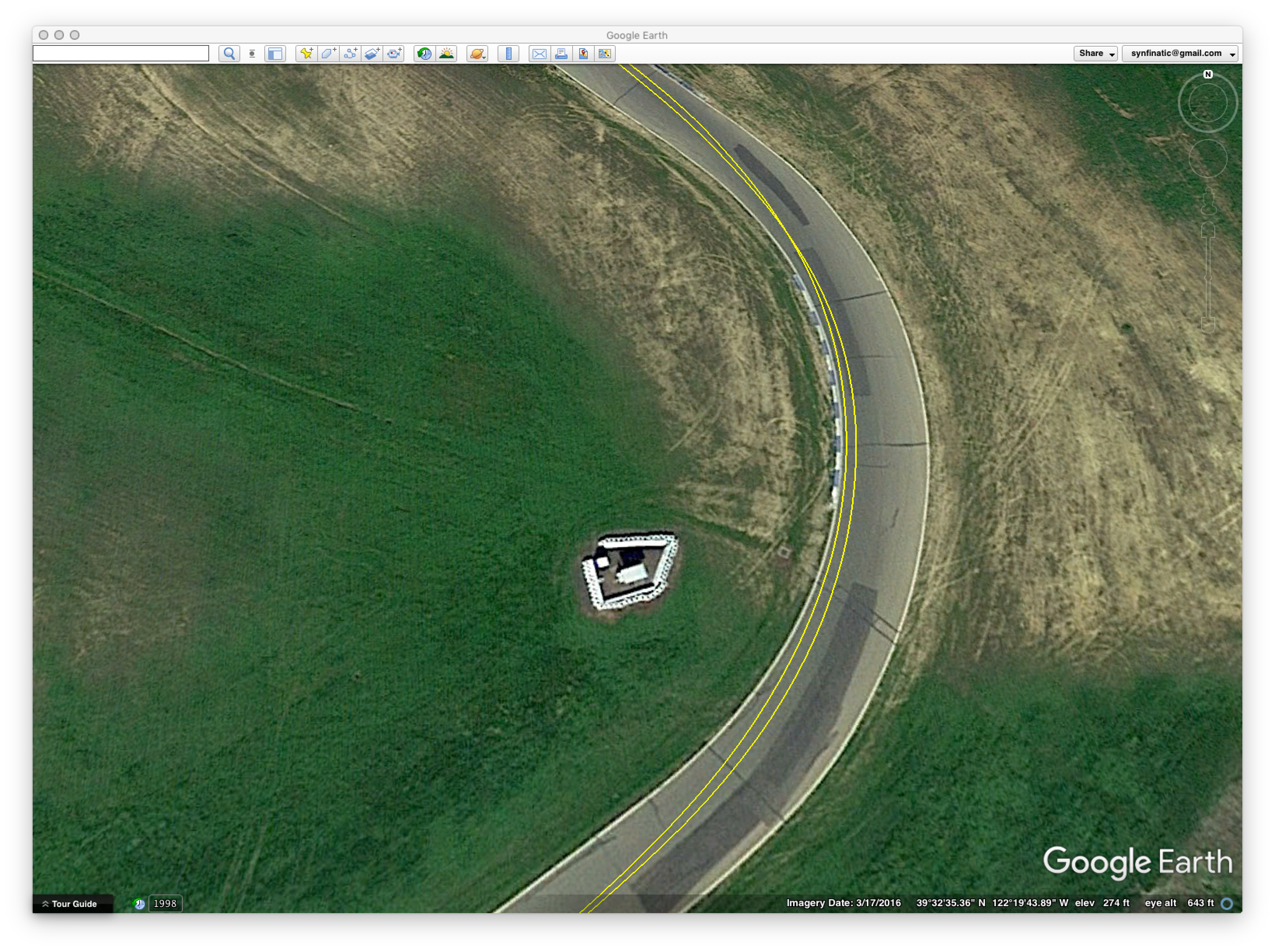
Ok, now we’re talking! I can clearly see that red line never apexes the corner. Actually, looks like even the inside/blue line is apexing the turn too early from the looks of it. Based on this information, it looks like I need to adjust my line to apex the corner later. This should also fix the need to make the correction we saw in the Corner Radius graph. If I do it correctly I should be able to carry the corner speed of the blue line and get to WOT sooner and make up time compared to both laps. Now I have something to focus on improving the next time I go out on track!
So that’s a very quick example of how I do data analysis with Race Studio 2. As you can see, the time slip feature not only makes it easy to identify areas of improvement, it quantifies the differences so you know where to focus your efforts. I do wish the Google Maps feature was better integrated, but honestly I don’t find needing it very often.
So now let’s take a quick look at another product which doesn’t have as good analysis software. Again, we’ll look at two laps in the same session at Thunderhill for T6:
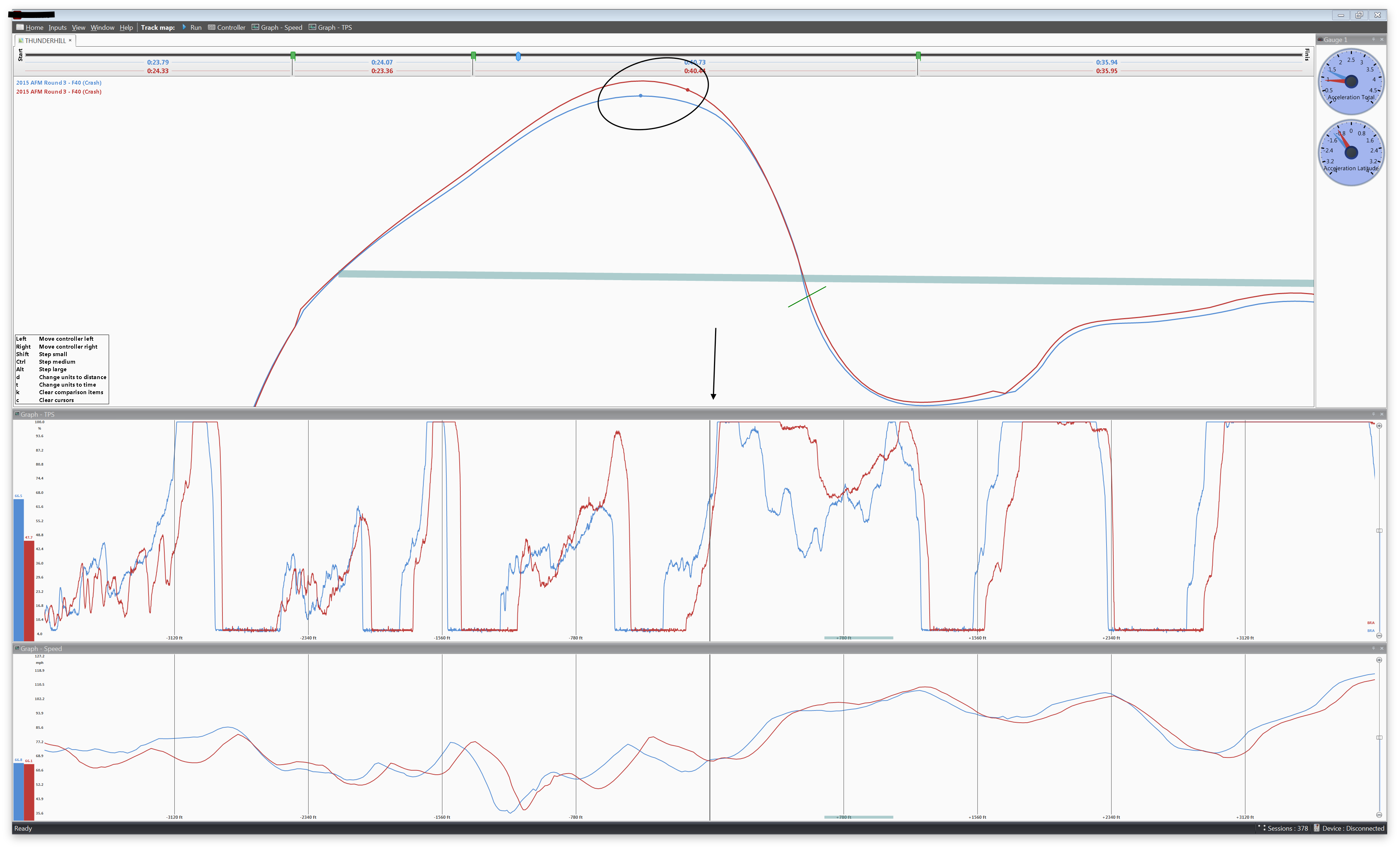
Ok, so a few things:
- Top graph is TPS
- Bottom graph is GPS speed
- There’s no brake pressure graph because I didn’t have one when this data was collected
- There’s no time slip graph because this software doesn’t support that
- What is going on with the dots representing the bike on track? Why are they so far apart?
So things break down here pretty fast. First you don’t know which lap is faster through T6. You just have 4 or 5 sectors (see the bar above the track map) which gives you some hints, but isn’t very granular. Just because one lap is overall faster doesn’t mean it’s faster everywhere or even faster in a given corner. To make things worse, because this software can’t normalize my data so that we’re looking at the same position on track, we can’t easily compare when I rolled on the throttle (see the the arrow) or my speed because the blue bike is at least 25ft ahead of the red one so of course it got on the gas sooner! This is because this software isn’t that advanced- it uses the literal distance traveled to determine where you are on the given line. So because the GPS saw the red line take a shorter lap around T1-5, it’s dot is behind the blue dot. Also worth mentioning, if you compare GPS data from two sessions taken weeks or months apart, due to how the GPS satellites orbit the earth the data can look far worse because the software isn’t able to normalize the data as the driven line shifts.
Also, there’s no way to easily export my GPS data to Google Maps (kml format) or anything like that, so I have no idea where the track edges are. That red line definitely looks wrong though! Let’s zoom out:
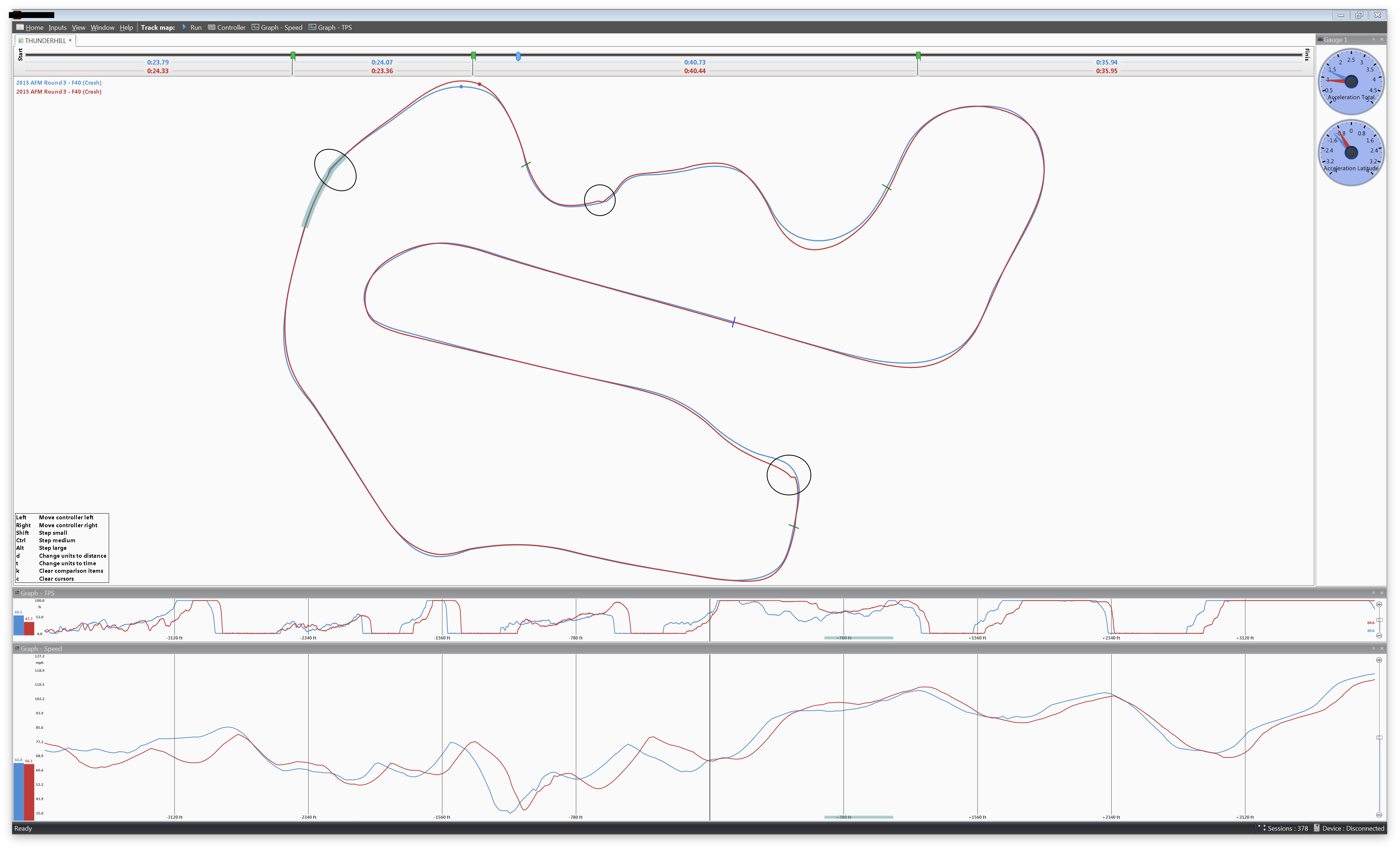
When we zoom out and look at both traces over the entire track we notice the driven lines are very different in a lot of key places. There’s also 3 very odd changes of direction which seem very suspect that I’ve circled. Since these were two laps from the same session one starts to wonder if I was being very inconsistent or is the accuracy of this product not as good? Note that both the AiM and this product use a 10Hz GPS chip, so it’s a software not sampling issue. Note: you can’t just play connect the dots to get a good trace. There’s actually a lot of math behind the scenes to make it work properly.
For the record, I didn’t intentionally pick this data to make this other product look bad. I just randomly picked two laps from a random session that I had in the database. That said, this is pretty consistent for what I’ve seen in general.
Anyways, the point is that before you buy something, be sure to try out the analysis software with some sample data and see if it makes it easy to answer the following questions:
- Over the entire lap, where was I faster? How granular can you be?
- How much time was gained/lost there?
- Why was I faster there?
If it’s not easy answer those questions, then it’s probably not very useful for doing comparative analysis.
One last comment: Some data loggers are “indirect” (recording only GPS/acceleration) while others are “direct” (recording via sensors either built into the bike or added on). Of course nowadays many loggers have both direct and indirect logging.
But does it matter? Both techniques can get the job done, but logging data collected via direct sensors for things like throttle position, brake pressure, RPM allows you to directly see the inputs the rider made to the throttle, brakes and gear changes rather then the result of those inputs. This takes away a lot of guess work and allows you to see things that just aren’t possible using indirect methods alone like how smooth you’re on the throttle and where you get to WOT which is pretty useful information to have!